Color Psychology
Home By Design

Home By Design
The five senses are an incredible thing. Smell and taste are two of the most powerful tools at evoking emotion. But sight must not be forgotten. After all, what you see can have an incredible impact on how you feel. Even more so, color can inevitably influence how you feel on an everyday basis without ever really noticing. Which is exactly why incorporating the most appropriate hues into your own home can have a profound effect on how you feel (or would like to feel) while completing a specific task.

Stay up to date on the latest real estate trends.

Real Estate
Discover Top Areas to Call Home in Castle Rock

Northern Colorado
Real Estate
Simplified Steps for a Stress-Free Home Renovation in Fort Collins

Home By Design
Some End Of Summer Favorites

Northern Colorado Real Estate
Northern Colorado Residential Market Analysis

Home By Design
Plants That Are Easy To Grow & Easy To Love
Home By Design
USING COLOR TO INFLUENCE YOUR MOOD AND PRODUCTIVITY
Home By Design
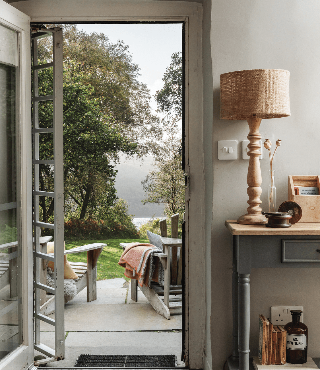
A SECLUDED HAVEN IN THE HIGHLANDS OF SCOTLAND

Home By Design
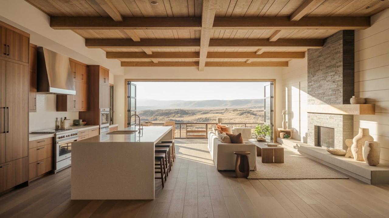
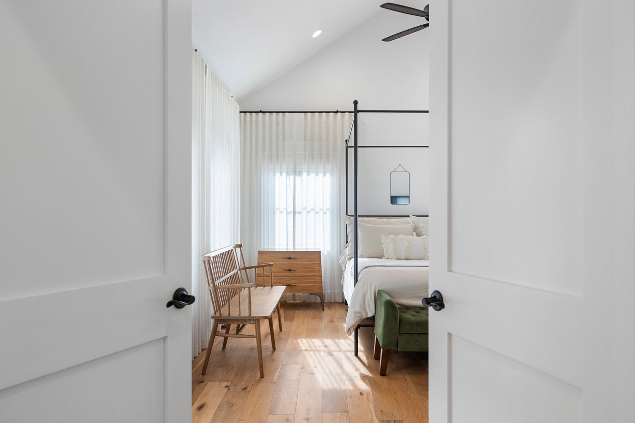
A MINIMALIST RETREAT ON THE SHORES OF AUSTRALIA’S PALM BEACH
We enjoy being able to provide the level of expert detail and understanding to our clients that we would expect as a client if we were working through the same process. Whether it be going through the home buying process or listing your home, we look forward to working with you soon!
Ready to start a conversation?
Fort Collins 242 Linden St, Suite 216, Fort Collins, CO 80524 Boulder 1470 Walnut St, Suite 201/202, Boulder, CO 80302 Denver 200 Columbine St, Suite 400, Denver, CO 80206